


Further Safer provides support to businesses and organisations that need to understand the risks facing travellers in today's world. Managing and reducing risks, and allowing their travellers to go further, work better, and be safer.
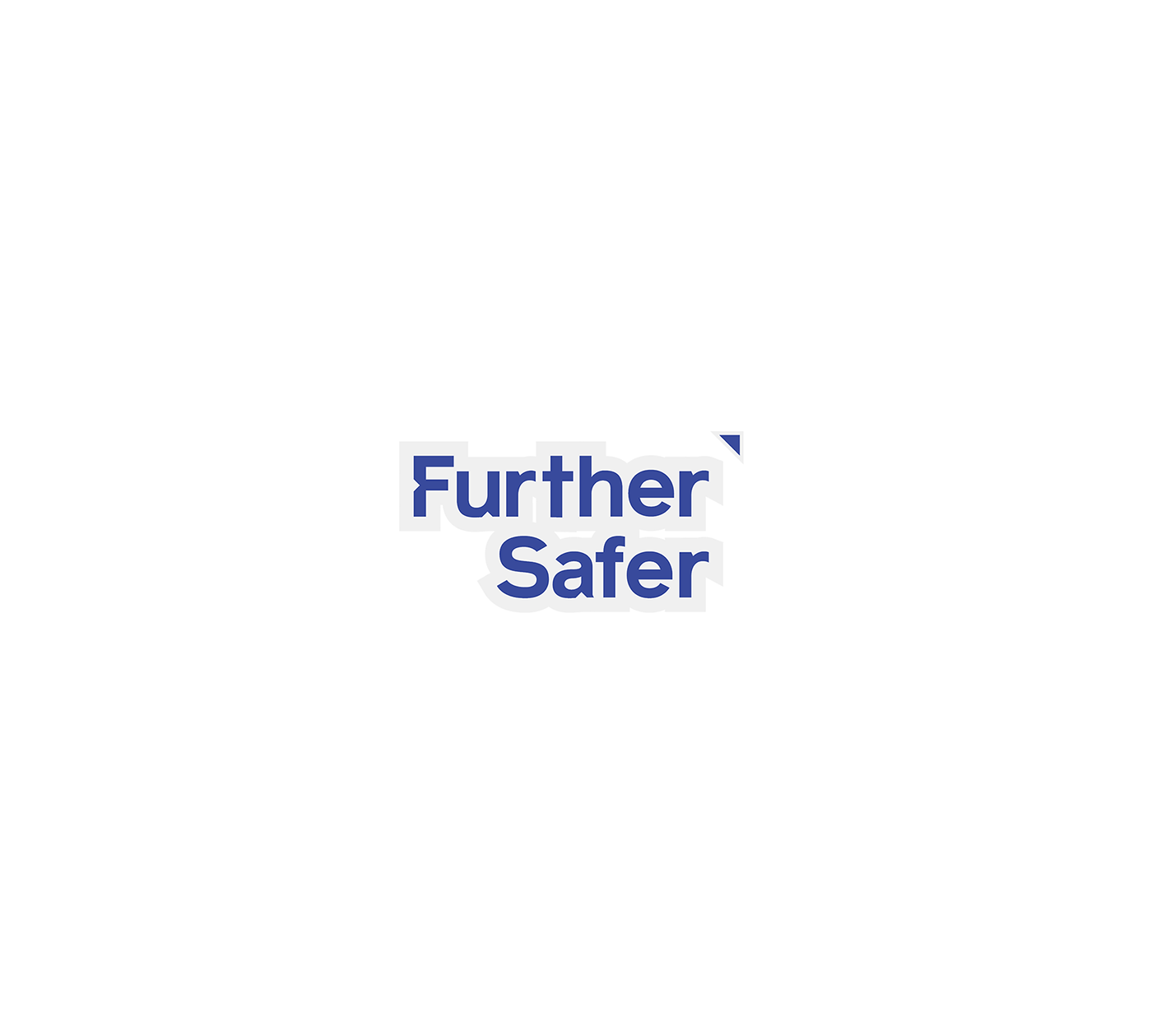
A custom typeface was created containing arrows within the typeface to symbolise a modern compass arrow and to also connect with going further. The colour blue is to associate with calmness, trust, loyalty and confidence. The subtle topographic map pattern was an extra background brand element for stationery and future online collateral.


